
Our New Brand
Publish date
KBR has undergone a considerable transformation in the past few years. As a result, KBR is a more upbeat and modern organisation, and it is time that our logo and brand reflected this fact. The new logo is a powerful representation to employees, investors and customers of who KBR is today and where we are headed.
What does the logo represent?
Each element of the logo has significance

- The sun represents our never-ceasing operations. Somewhere around the globe, our team is always at work to meet the needs of our customers. The sun truly never sets on KBR!
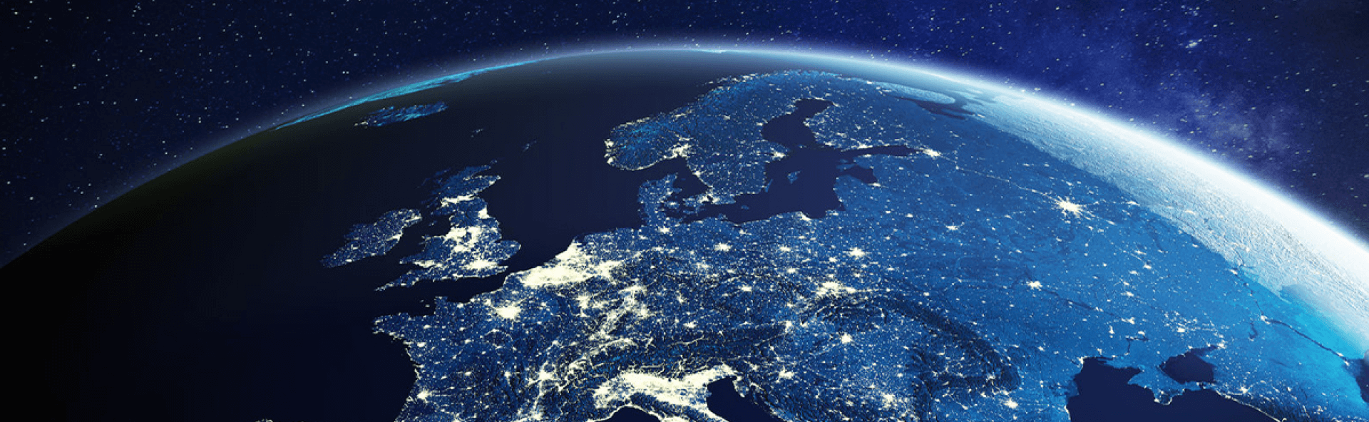
- The globe connects the current KBR back to our roots and its vantage point in space represents our global reach.
- The squares represent our focus on digitalisation, which is a high priority across every one of our business lines. KBR must be able to provide solutions that meet the needs of the modern world.
- The colours of the squares represent the environments where KBR delivers:
- Sky
- Land
- Outer Space
- Water